The Ultimate Guide for Choosing Neutral Paint Colours for Your Home
It can be overwhelming to choose the perfect neutral paint colour, especially if you want your space to reflect your style and remain functional. Many homeowners have trouble choosing neutral colours. They want something timeless and versatile, elegant and cozy, yet calm. You might struggle to find the perfect shade of white, grey, beige or greige. With nearly 30 years of experience decorating and painting houses, I have a wealth of knowledge on how to make these decisions. In this blog, I will share my tried-and-tested recommendations for neutral paint colours, as well as expert tips on how you can choose the right one for your room.
Neutral Paint Colors: Basics
Neutral colours can be used in many different home styles. From modern minimalists to cozy cottages, neutral paints are versatile. The term neutral refers to shades that are made up of black, white and other pigments. This usually results in a subdued earthy or soothing shade. Neutral colours are beautiful because they can provide a soft background for other elements in your home such as artwork, furniture and decor. They create an environment that’s harmonious and balanced.
The simplicity of neutrals can also make them difficult to use correctly. Neutrals are more beautiful than bold colours because they have subtle undertones that can be influenced by the surrounding decor, light and room size.
It can be difficult to choose a neutral colour especially when it is a seemingly simple off-white, beige, or tan. However, the undertones of pink, green, or grey could change the mood in your room. It is important to test neutral paint colours and give them careful consideration.
How to choose neutral paint colours
1. Decide Between White, Beige, Grey, or Greige
You’ll have to decide whether you want to paint your room white, beige or grey. Each option has different characteristics and qualities that can change the mood in the room. Let’s take a look at each of them:
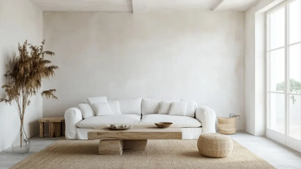
- White: White is timeless, airy and clean. It’s a great choice for interiors. It can feel cold or sterile in certain lighting situations, especially in rooms that receive little natural light. Whites that are warmer than off-whites add depth and warmth to a room, so they’re a better choice for many.
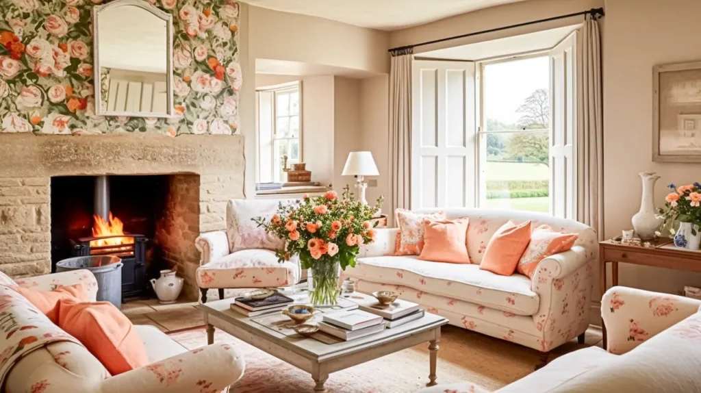
- Beige Beige gives a warm and comforting feel. It is a more relaxed option than white. The earthier, softer tones make it an excellent choice for bedrooms, living rooms and other areas where comfort and tranquillity matter. Be careful when choosing yellow or pink-based beiges, as these can look dated in some settings.
- Grey: grey is the most sophisticated neutral. Grey is versatile and offers depth, from lighter, airy shades to deeper, moodier tones. Grey can work in many different spaces and lighting conditions. However, if the undertones are not chosen correctly, it could be cold and icy. To avoid a gloomy feeling, choose a grey with warm undertones in rooms without natural light.
- Grige: A mix of beige and grey, Greige is a neutral colour that balances both colours. It is a neutracolouror that has a subtle warmth. It works in any room. Greige is a neutrcolourlor with a grounded, earthy vibe. It pairs well both with warm and cool accents.
2. Warm Tones vs. Cool Tones Warm Tones
The next step after deciding ocolourolor family (white or beige or grey or greige) is determining whether you want a warm or cool tone. You can determine the look of your neutral by determining whether it is warm or cool.
- Cool Tones can be characterized by the presence of undertones in blue, green or purple. They make a space feel lighter and more airy. Colour colours are great for rooms with lots of natural light, especially those facing south. They help to balance the heat and create a calmer atmosphere. These rooms would benefit from a cool white or grey, which will reflect the light without getting too warm. Colours have yellow, brown, or red undertones. These colours create a more welcoming, cozier environment and are perfect for rooms with less natural light. Warm neutrals create a cozy, intimate atmosphere in a room.
You can choose a neutral colour that balances warm and cool tones if you have a mix of natural lighting in your room. Greige, for example, is a great neutral that offers a harmony of both.
3. Be aware of the lighting in your room
Lighting in a space can have a dramatic impact on how paintcolourss will look once they are paintedColoursrs can seem brighter and vibrant in rooms with lots of natural lighColoursors can appear darker or cooler in rooms with less natural lighting. You can use cooler neutrals in a room that has plenty of natural light. For example, greys with blue undertones and pure whites. If your room is dark, warmer neutrals create a more welcoming space.
Neutrals to Different Room Orientations
Each room will receive different types of natural lighting depending on the orientation (north or south, east or west). The amount and direction of sunlight will affect the look of your neutral paint in the room. How to pick neutrals for your room based on its orientation
Neutrals to be used in South-Facing Rooms
South-facing rooms receive strong, clear sun all day long. This is great for brightening a room but can also intensify warm undertones. In these areas, neutrals that have a lot of red, yellow or orange undertones may look sickly or too warm.
Look for neutrals that have cool undertones. For example, whites with hints of blue, green or violet. These colours will balance the intensity of natural light and create a serene, calm atmosphere in your room. You can also go for cool beige or soft grey tones.
Neutrals are to be used in rooms facing north.
Rooms facing north tend to have a cooler, diffuser light. This is great for avoiding direct sun exposure but can make a room feel cold or dark. Use neutrals that have warm undertones to warm up your space. For example, beige with a touch of yellow or warm taupe. These colours will create a warm and welcoming atmosphere in the room.
If you want a minimalist, cooler look, try deeper greys and taupes. They can create a more dramatic atmosphere.
Neutrals to be used in East- and West-Facing Rooms
The morning sun shines brightly on rooms facing east, and the afternoon and evening sun is intensely bright for rooms facing west. The quality and quantity of light in these rooms can vary dramatically during the day.
Consider neutrals with cool undertones for rooms facing east to balance out the warmth of morning light. Use neutrals to complement the late-day, strong light in rooms facing west. Try warm shades to enhance the golden tones in the evening light. These could be soft greys or taupes with brown or red undertones.
Neutrals in Small and Large Rooms
A room’s size can affect the colour of the paint. Lighter neutrals will make a small room feel bigger and more spacious. Pale whites and beige can reflect light to create the illusion of more space.
Darker neutrals create warmth and intimacy in larger rooms. Use deeper greys or taupes to create a cozier feel in a large space. You can also embrace the space and use the same neutral colour for the ceiling and walls. This will help to blur the lines between thetwo andd make the room seem larger.
Popular Neutral Paint Colors
Here are my top neutral paint colours sorted by their undertones, characteristics and specific qualities:
Whites
- Heart Felt by Crown Paints x ELLE Decoration: Soft, faded white which blends both classic and contemporary styles beautifully.
- Fuji by Paint & Paper Library: An elegant white with a touch of warmth.
- “Slaked Lime” by Little Greene: An off-white colour with warm undertones, which works well in many lighting conditions.
Beiges
- “Flawless” by Crown Paints and Elle Decoration: This gentle beige has subtle mauve undertones, perfect for creating a relaxing atmosphere.
- “Clay Pale” by Little Greene Light, neutral beige, with a soft, smooth finish.
- “Mushroom” by Little Greene: Classic beige with a hint of red oxide to add warmth.
Greys
- “Shallows” by Little Greene: An elegant, cool grey with subtle pigmentation.
- Ammonite by Farrow & Ball: An understated, cool grey with a refined edge.
- ‘Elephant’s Breath’ (Farrow & Ball): Warm, contemporary grey with a hint of magenta to create a unique look.
Greige and Taupe
- “Modest” by COAT Paints: An off-white greige that adds warmth to the room without overwhelming it.
- Stirabout by Farrow & Ball An earthy, warm taupe inspired by Irish porridge. Perfect for creating a cozy and welcoming atmosphere.
- Crown Paints – ‘Potted History: An earthy, muted taupe with a restful tone that adds depth and tranquillity.
Testing Paint Samples
It doesn’t matter how much time and effort you spend researching neutral paint colours. Nothing beats trying it out in your home. The colour of paint can appear completely different in your home than on an online picture or small swatch. It can also change depending on lighting conditions.
Test several samples on large white cardboard pieces
Use painter’s masking tape to draw boundaries. Watch the paint under both artificial and natural light to see how it changes at different times of the day. This will help you choose a neutral colour that compliments your room and creates the mood you want.
Conclusion
Neutral colours offer versatility and elegance, making them the perfect foundation for timeless design. If you want to create a tranquil sanctuary or an open, vibrant living space, understanding natural light, size, layout, and undertones will help you choose the perfect neutral. Following these expert tips will help you choose a neutral colour that enhances your space’s beauty and functionality.
Take your time to test out the colours before you commit. It’s worth putting in a little extra work at the start to create a space that feels harmonious and cohesive. Happy decorating!